


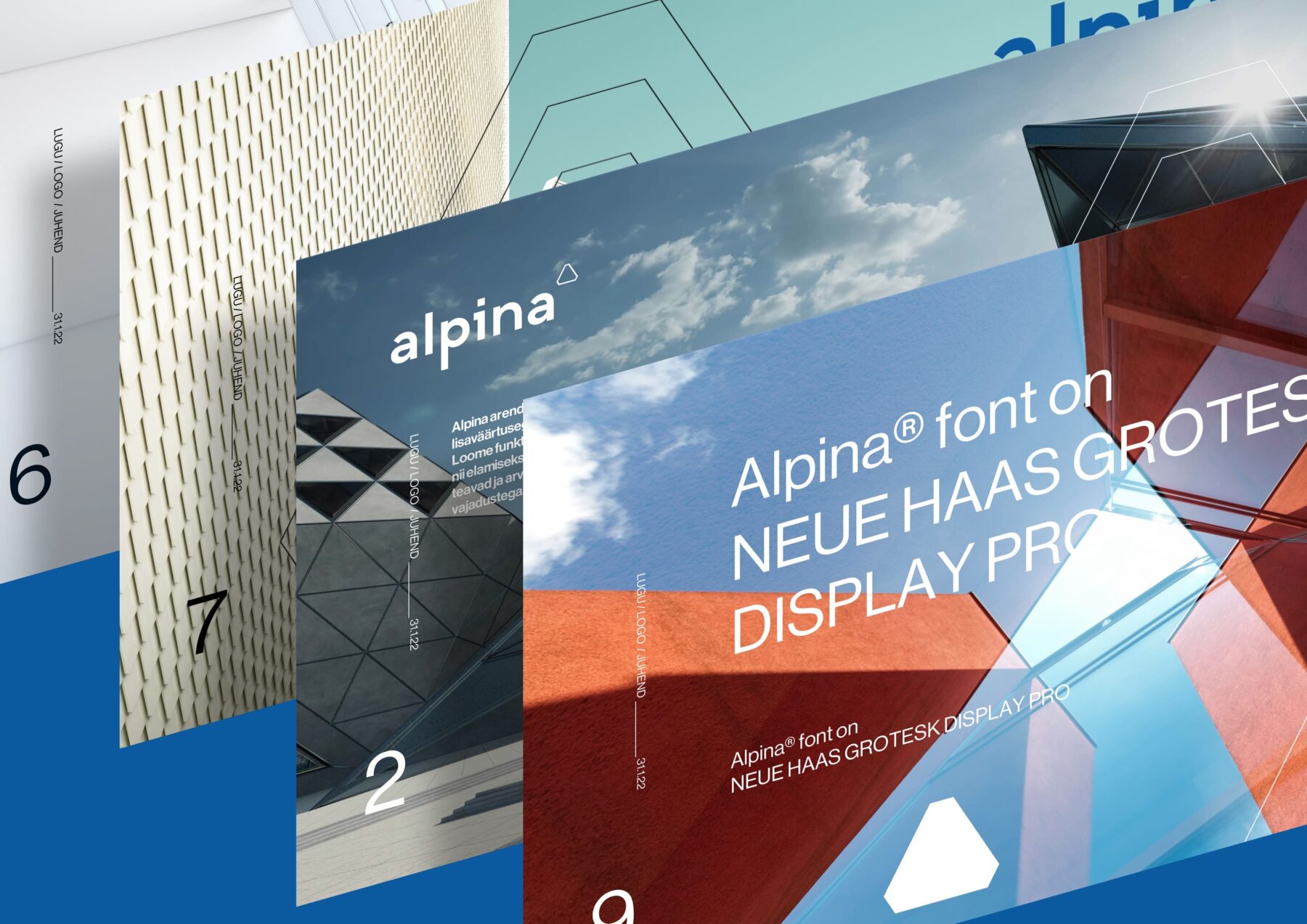
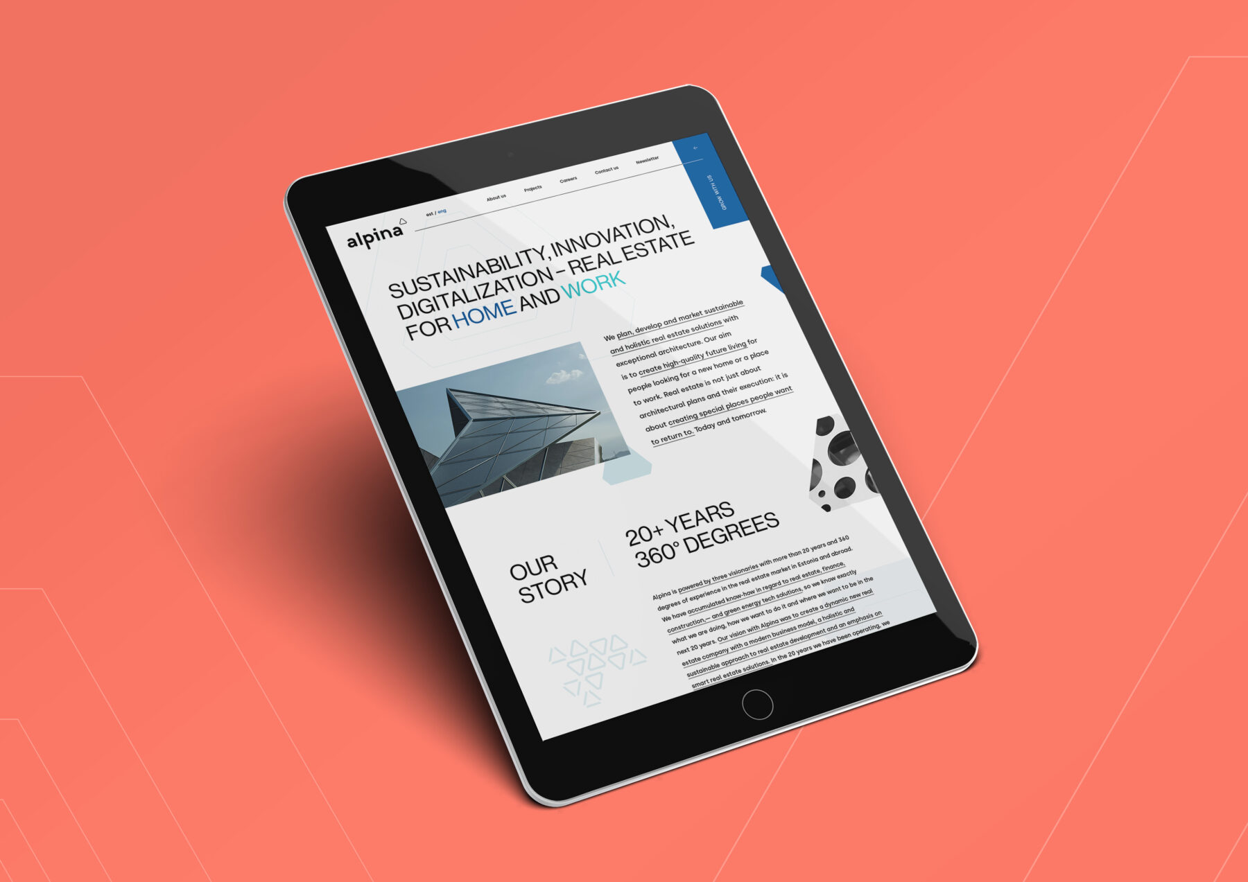


Alpina® real estate identity & website
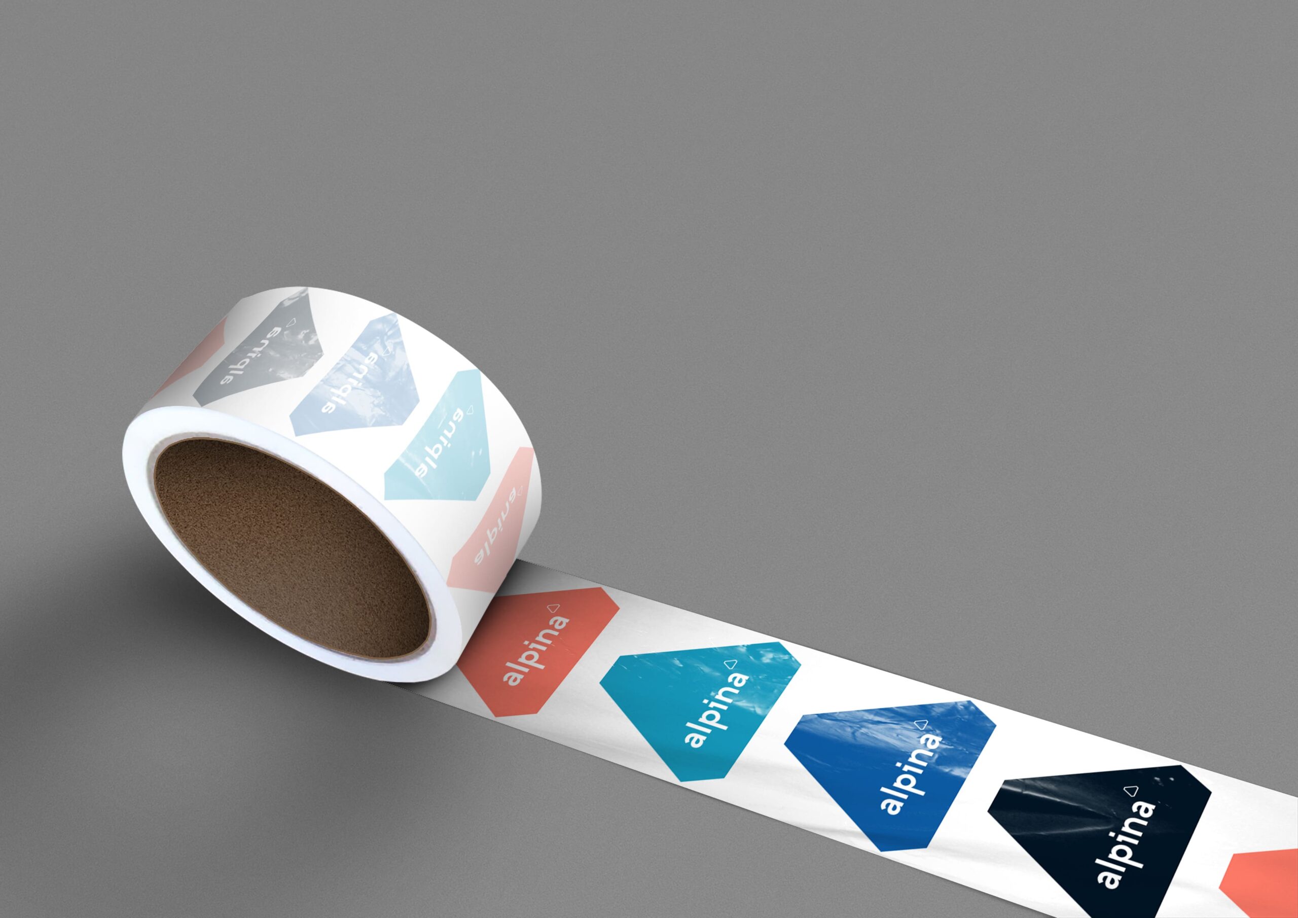
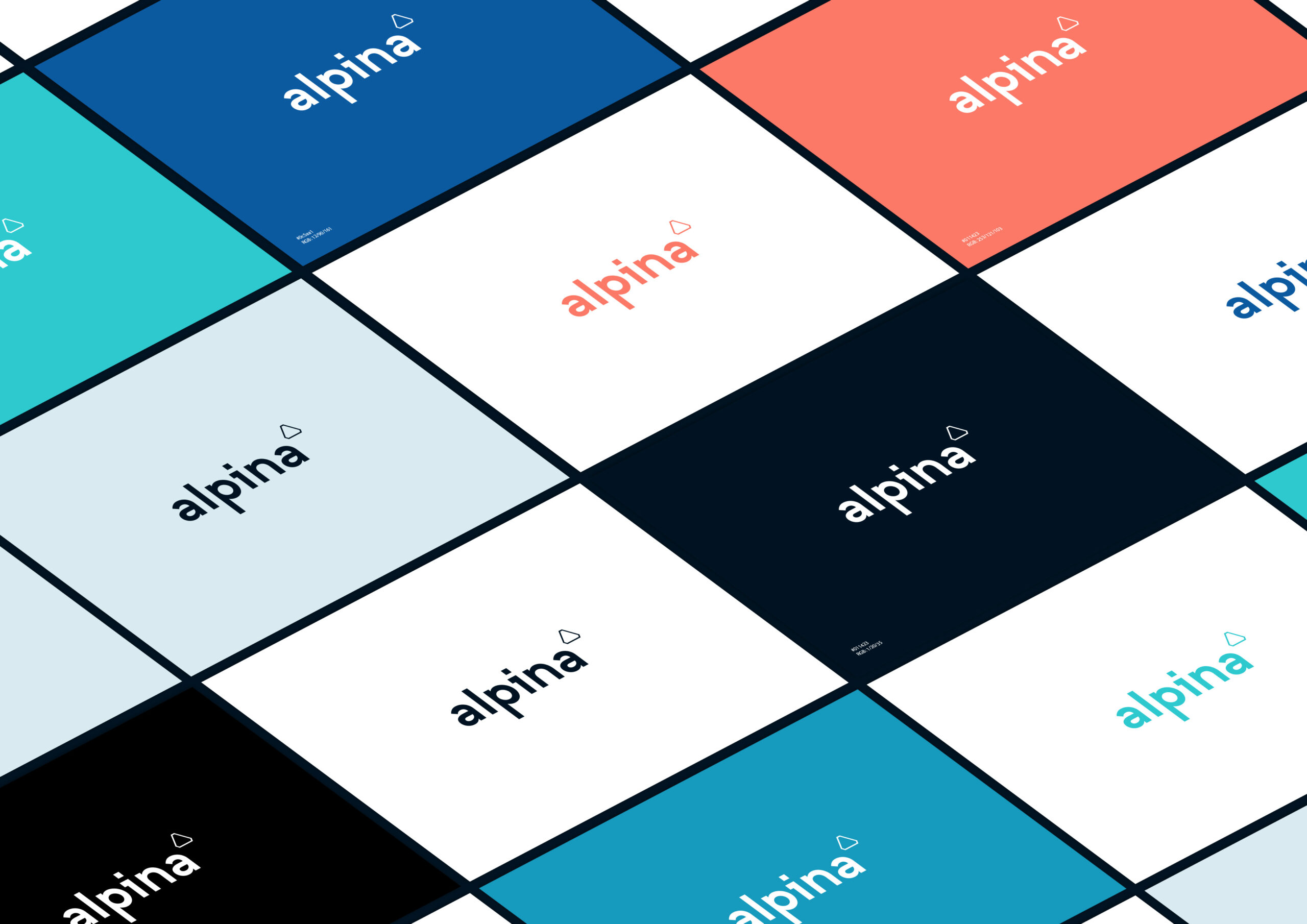
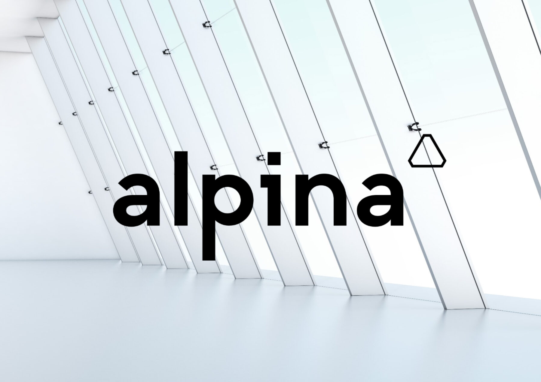
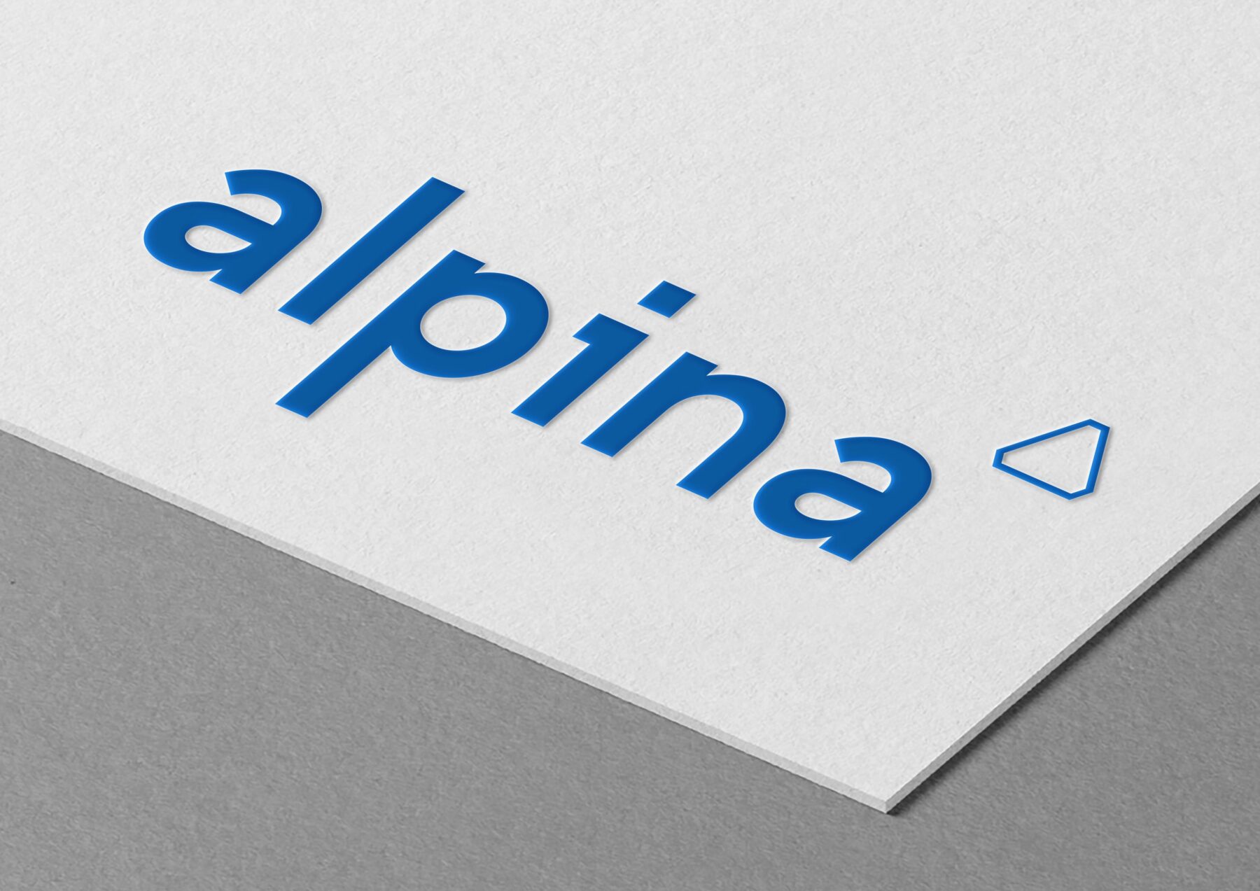
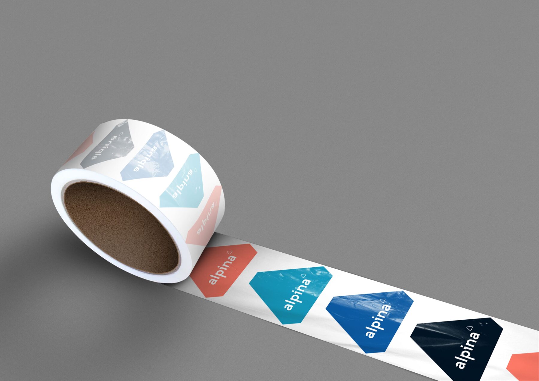
We designed a triangle-shaped brand to symbolize the ambition of Estonia’s three real estate experts. The triangle also represents sustainability, digitalization, and innovation.
PRODUCT:
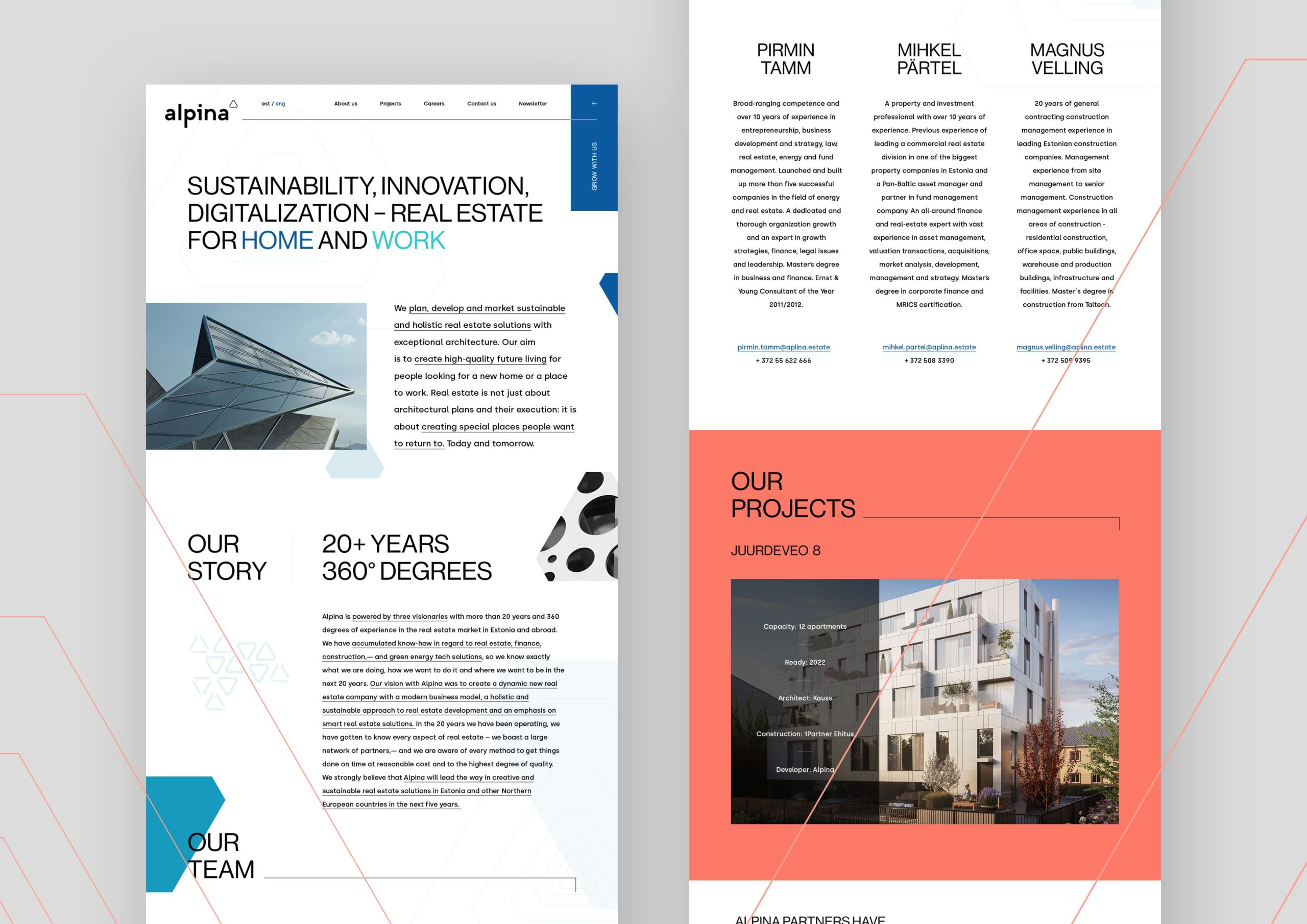
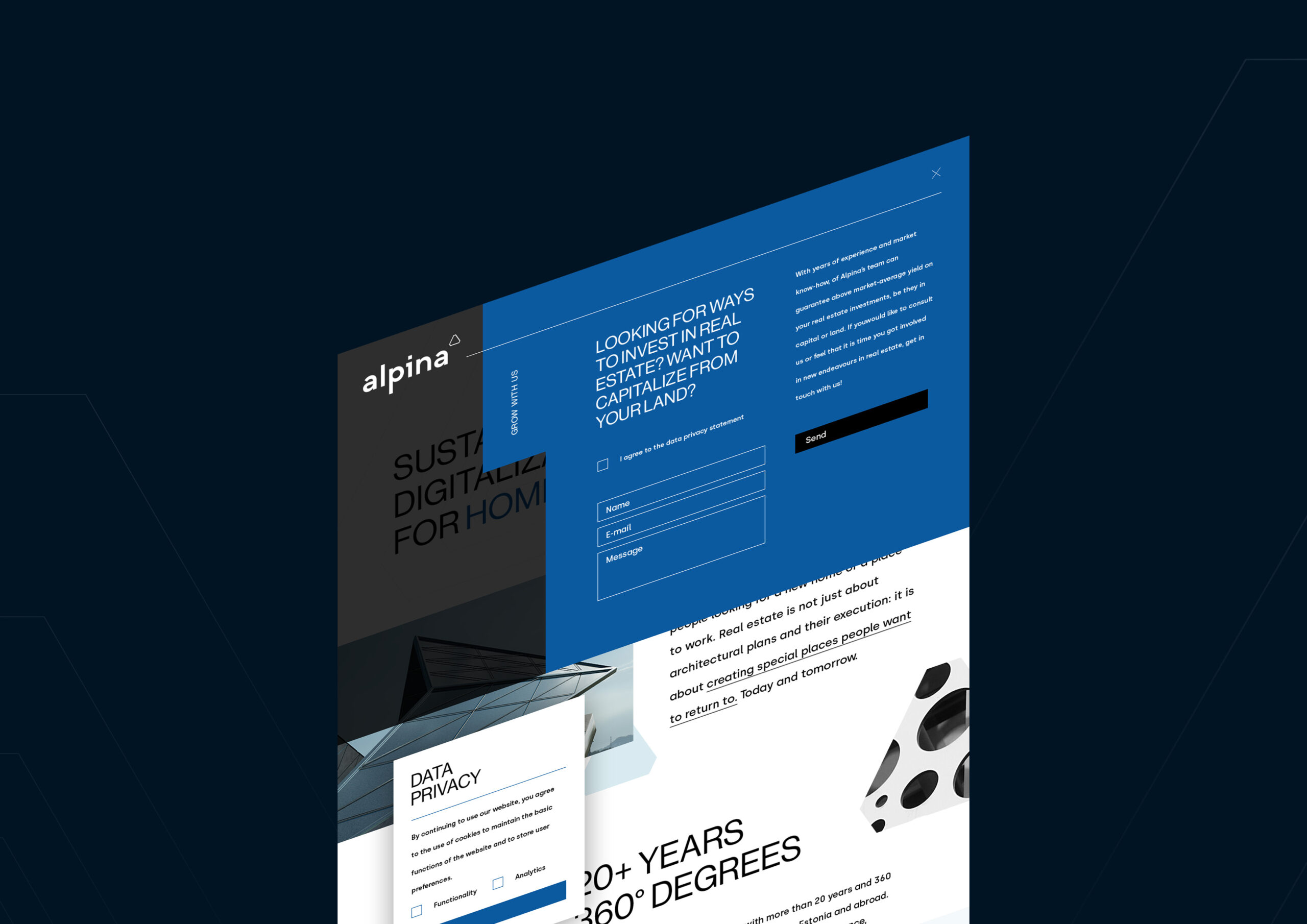
Alpina® is a modern real estate company that was founded by three property gurus – Mihkel Pärtel, Magnus Villing and Pirmin Tamm.
PRODUCT INSIGHT:
Alpina® emphasizes sustainability, digitalization and innovation as the pillars of real estate development for work and home.
TARGET GROUP:
Home buyers, office renters & investors
WORK:
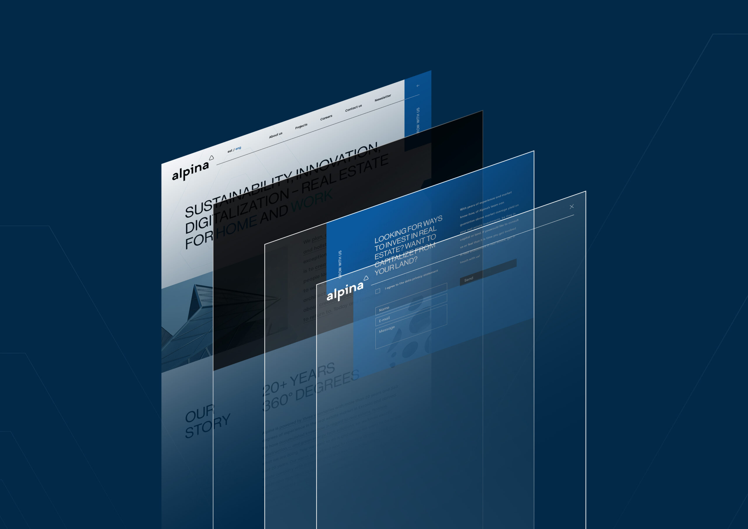
Identity & webpage design
CREATIVE INSIGHT:
Both the identity and webpage come with an intentionally bold and fresh attitude. The logo was designed in lower case and using an architectural geometrical font as a basis, reworking it to better fit our vision. The logo sign is a derivation of the letter A, and it has three angles that represent the three USPs of the company, as well as its three owners. The triangle in the graphics was inspired by the logo sign, thus creating a well-built design system for the new brand.